Deck Features
Feature cards pile up like a deck as you scroll, and the last one slides through them all. Use it on a landing page to show 3 to 6 features.
Everything you need to make the web feel human again.
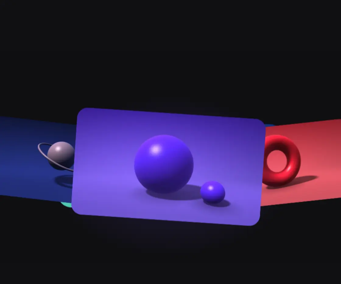
Motion that feels made by hand
Every animation is timed and eased by hand, down to the curve, so it guides the eye instead of showing off.
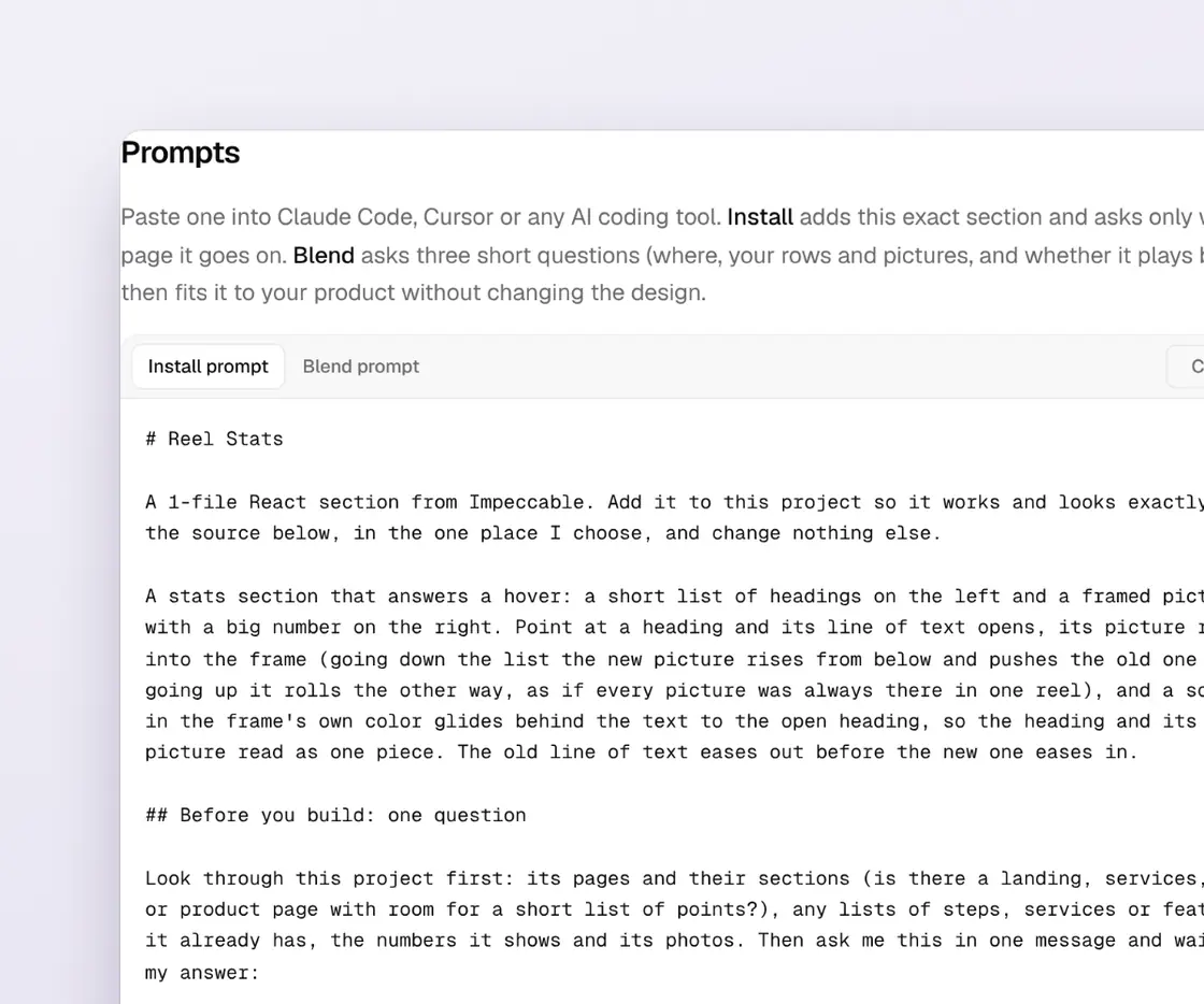
Two prompts with every piece
Install drops in the exact piece. Blend asks a few short questions, then fits it to your brand without breaking the design.
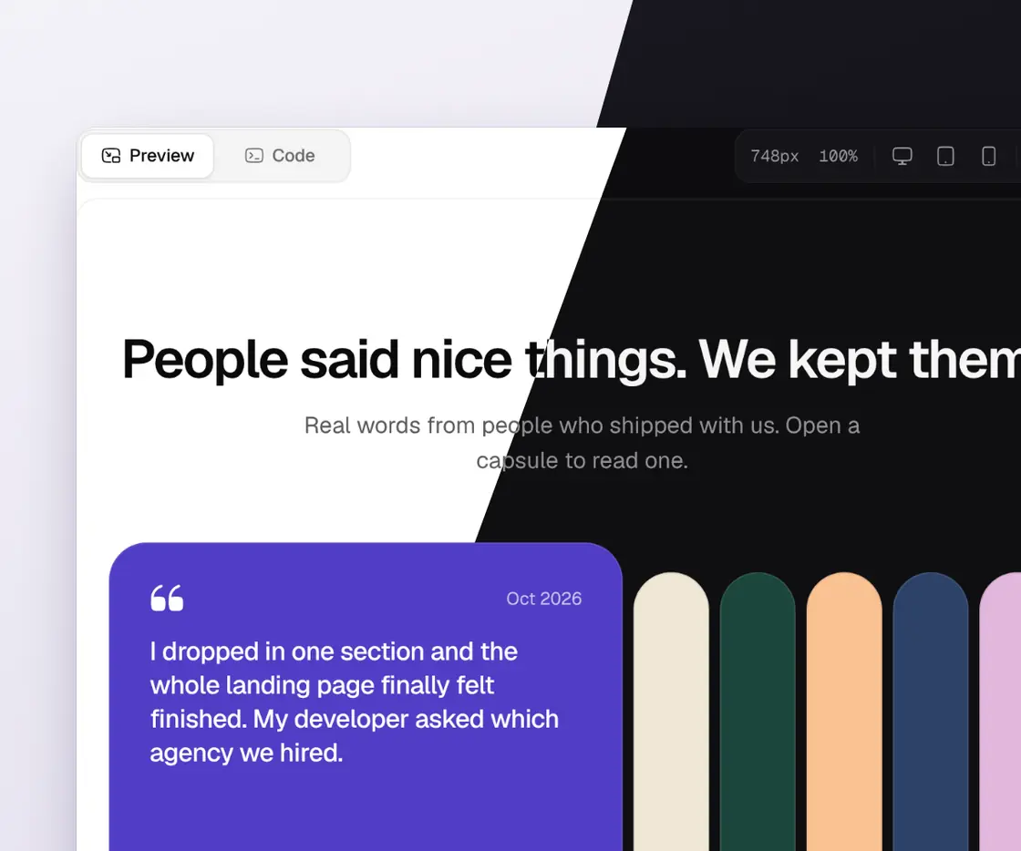
Light and dark from day one
Each piece reads your own theme colors, so it switches with your site and never looks pasted in.
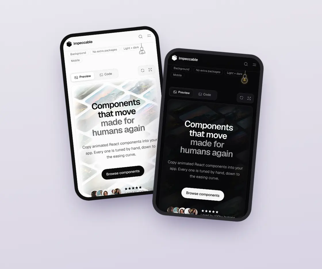
At home on every screen
Tested at phone, tablet and desktop widths, with fingers, mice and keyboards in mind.
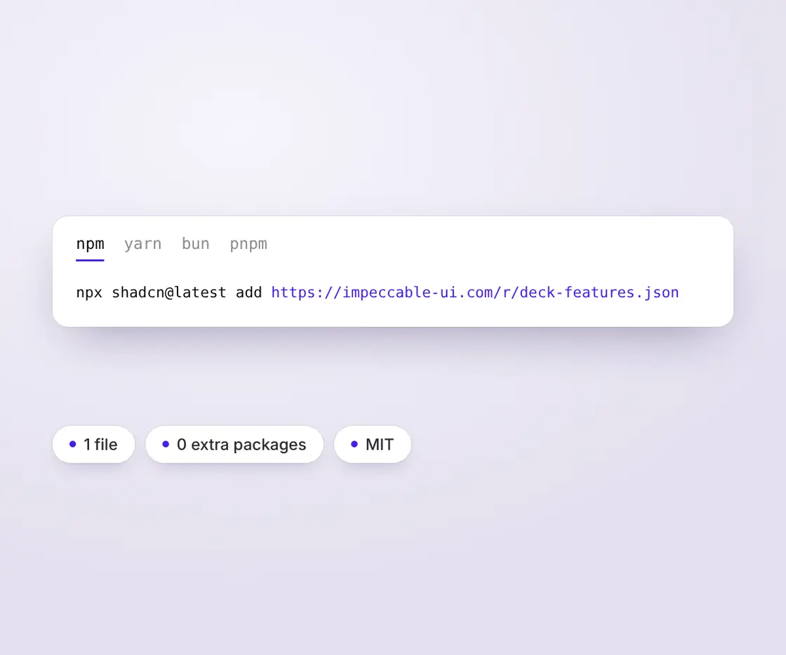
One command, no extra packages
Run one line and a single file lands in your project. React only, MIT licensed, yours to change.
npx shadcn@latest add https://impeccable-ui.com/r/deck-features.jsonRun it in a project set up with shadcn. No other packages needed. Or open and copy the file into components/ui/deck-features.tsx.
Prompts
Paste one into Claude Code, Cursor or any AI coding tool. Install adds this exact section and asks only which page it goes on. Blend asks four short questions (where, your features and pictures, your words, and how tight the deck is), then fits it to your product without changing the design.
# Deck Features

A 1-file React section from Impeccable. Add it to this project so it works and looks exactly like the source below, in the one place I choose, and change nothing else.

A features section you scroll through: a small chip and a heading, then one card per feature with a picture on one side and a heading and a line of text on the other, swapping sides from card to card. As you scroll, each card sticks a little lower than the one before, so they pile up like a deck with the top edge of every earlier card still in view, and the cards underneath lean back and dim. A small number on each card's top edge keeps count. The last card does not stop: it slides up through the whole deck, covering it, and the deck leaves the screen with it.

## Before you build: one question

Look through this project first: its pages and their sections (is there a landing, home or product page with room for a features block?), any list of features or services it already has, its pictures and screenshots, and whether it has a fixed header (and how tall it is). Then ask me this in one message and wait for my answer:

- **Which page should it go on, and between which sections?** Suggest the 1–3 best places from my pages (it works best on a landing page, after the hero, where 3 to 6 features each deserve a picture).
  *Why: it takes a few screens of scrolling to play, so it needs a page long enough to scroll and a spot where people want the details.*

Ask nothing else. If I say *skip*, use the best suggestion. The section needs cards to show: use my real features and pictures if you found them, otherwise placeholder text and any pictures already in the project, and tell me which ones need replacing.

## Keep it as it is

The section is the design: the chip and heading, the cards with the picture and words swapping sides, the deck that piles up with 20px of every earlier card in view, the cards underneath leaning back and dimming, the pictures and words settling as each card lands, the counting numbers on the top edges, and the last card sliding through the whole deck and carrying it away, with soft 24px corners. Keep them exactly as in the source. If something doesn't fit my project, tell me instead of changing it.

- Add only the section file and the one place I picked. Don't add packages, change other files, or restyle anything.
- Don't add the demo parts from the Impeccable website: the scrolling preview box, the preview size buttons and fullscreen, the hint text, the sample pictures and the self-scrolling TV on the home page.

## Fastest path

If this project has a `components.json` (shadcn), run `npx shadcn@latest add https://impeccable-ui.com/r/deck-features.json`.
If the command succeeds, only fix import paths to match this project and skip ahead. If it fails or there is no `components.json`, build it by hand as below.

## Build it

- Stack: React 18 or 19 with TypeScript. No other packages: `position: sticky` and the page's own scrolling move everything, and the script only sets a few numbers.
- JavaScript project? Name the file `deck-features.jsx` and remove the type annotations; nothing else changes.
- Create this file, in this project's usual place for components:
  - `components/ui/deck-features.tsx`
- Keep these exports and their names: `DeckFeatures`, `DeckFeaturesProps`, `DeckFeaturesItem`. `DECK_FEATURES` holds the sample cards; it can stay or go.
- Keep `"use client"` at the top in Next.js App Router projects. In other setups it is harmless. A page that renders it can stay a server component; only the section itself is client code.
- Keep the CSS block and the tuning values at the top (`OFFSET`, `STEP`, `PHONE_STEP`, `WIDE_RATIO`, `NARROW_RATIO`, `SHRINK`, `MAX_DEPTH`, `DIM`, `SETTLE_SCALE`, `SETTLE_RISE`, `SETTLE_FADE`, `GAP`, `BADGE_MS`, `easeOut`, `smooth`) exactly as written. They are the design: the deck sticks 96px from the top, each card shows 20px of the one under it (70% of that on narrow sections), a card is at most half as tall as it is wide (1.4 times on narrow sections), a card under the top one shrinks 2.5% per card above it (counting up to three) and dims up to 14%, an arriving picture eases from 6% bigger to its size while its words drift up 24px and fade in from 45%, cards start 32px apart, and the numbers change color over 360ms.
- Keep the colors as theme variables: everything reads `--foreground` and `--background` (or `--fg` and `--bg`), the number on the top card uses `--primary` (else `--accent`), and the corners are three times `--radius-lg` (24px with an 8px theme radius) with the pictures inside at that minus the 8px padding. Never swap them for fixed hex or pixel values.
- Keep the speed rules: only `transform` and `opacity` change while scrolling, the script listens to scrolling only while the section is on screen and reads every card before it writes anything, and pictures keep `loading="lazy"` and `decoding="async"`. So it adds nothing to the page's load time.
- Keep the fallbacks: with `prefers-reduced-motion: reduce` the cards still stack (that is the page scrolling), but nothing shrinks, dims, grows or drifts, and the numbers change color at once; a picture that fails to load leaves a soft tinted panel with the words still readable; pictures can't be selected or dragged; the cards are a numbered list (`<ol>`) with a real heading on each, and the drawn numbers are hidden from screen readers; an empty `items` list shows nothing.

## Use it

```tsx
// app/page.tsx (the page I picked)
import { DeckFeatures } from "@/components/ui/deck-features";

const FEATURES = [
  { title: "Plan in minutes", description: "Drag tasks onto the week and the plan fills itself in.", src: "/features/plan.jpg", alt: "The weekly planner" },
  { title: "See where time goes", description: "Every hour lands in a simple chart you can share.", src: "/features/chart.jpg", alt: "The time chart" },
  { title: "Works where you work", description: "Slack, Linear and your calendar, all in one place.", src: "/features/apps.jpg", alt: "App connections" },
];

export default function HomePage() {
  return (
    <main>
      {/* ...my existing sections... */}
      <DeckFeatures eyebrow="Features" title="Everything your week needs, in one calm place." items={FEATURES} offset={88} />
      {/* ...the next section... */}
    </main>
  );
}
```

- Put it between the two sections I picked, full width. It centres its own 1152px stage with 16px sides, so don't wrap it in extra padding.
- `items` takes `{ title, description, src, alt }`; any number works, 3 to 6 read best. Any picture size works: each is cropped to its side of the card.
- If my site has a fixed header, set `offset` to its height plus 16px, so the deck never slides under it. Without one, keep the default (96).
- No parent between the section and the page's scroller may have `overflow: hidden` (it stops the cards from sticking). If one does, tell me and suggest `overflow-x: clip` there; don't change it without asking.

## Check

- It type-checks and the page renders with no console errors.
- Scrolling down, the first card sticks `offset` px from the top, and each next card slides up over it and stops 20px lower, so the deck shows a strip of every earlier card with its number. The cards underneath shrink a little and dim as each new card covers them, and each new card's picture and words settle as it lands. The last card keeps going: it slides through the deck, covering it, and the deck scrolls away with it. Nothing jumps, and the page loads as fast as before.
- It looks right in light and dark mode (check both): the cards, chip, numbers and words in my theme colors, the top card's number in my accent color.
- It stays smooth on a phone at 375px wide: picture on top and words below, the whole deck fits on the screen, nothing scrolls sideways, and long words wrap inside their card.
- With `prefers-reduced-motion: reduce`, the cards still stack, but nothing shrinks, dims, grows or drifts.
- Nothing else on the site looks or behaves differently.
- Finish with a short report: the files you added or changed, where it's placed, and every place where you had to do something differently from the source, and why.

## Source

The reference implementation. Copy it as-is, then apply only the changes listed above.

### `components/ui/deck-features.tsx`

```tsx
"use client";

/**
 * Deck Features, from Impeccable.
 *
 * A features section you scroll through. A small chip and a heading sit on
 * top, then one card per feature: a picture on one side and a heading with a
 * line of text on the other, swapping sides from card to card. As you scroll,
 * each card sticks a little lower than the one before it, so they pile up
 * like a deck and the top edge of every earlier card stays in view. The last
 * card does not stop: it slides up through the whole deck, covering it, and
 * the deck leaves the screen with it.
 *
 *   - The deck leans back. While a card slides over the deck, the cards under
 *     it shrink a little (2.5% per card, up to three) and dim, so the newest
 *     card always reads as the one on top. It follows how much of the deck the
 *     new card covers, on a slow-start, slow-end curve, so it moves with the
 *     page, not with a timer.
 *   - A card settles as it arrives: its picture eases from 6% bigger to its
 *     size and its words drift up 24px and fade in, on an ease-out curve tied
 *     to how close the card is to its place.
 *   - A small number sits on the top edge of every card, in the middle. The
 *     numbers of the cards in the deck line up in a short column: the card on
 *     top has a colored one, the ones under it are solid, the ones still
 *     coming are outlined.
 *   - Native scrolling moves everything (position: sticky). The script only
 *     sets a few numbers while the section is on screen, and the motion is
 *     transform and opacity only. Pictures load lazily.
 *   - Works in a scrolling box too (it finds the nearest scrolling parent).
 *     No parent between it and that scroller may clip it with overflow: hidden.
 *
 * No packages. Colors come from the page's own theme variables
 * (--foreground / --background, else --fg / --bg; the colored number uses
 * --primary, else --accent), so it follows light and dark mode.
 */

import { useEffect, useRef, type CSSProperties, type ReactNode } from "react";

export type DeckFeaturesItem = {
  /** The feature, in a few words, like "Two prompts with every piece". */
  title: ReactNode;
  /** The line of text under it. One or two sentences. */
  description: ReactNode;
  /** The picture. Any size: it is cropped to its side of the card. */
  src: string;
  /** What the picture shows, for screen readers. */
  alt: string;
};

export type DeckFeaturesProps = {
  /** The cards, top to bottom. Any number; 3 to 6 reads best. Every card but the last joins the deck. */
  items: DeckFeaturesItem[];
  /** The small chip above the heading. Pass null to hide it. */
  eyebrow?: ReactNode;
  /** The heading above the cards. Pass null to hide it. */
  title?: ReactNode;
  /** Where the deck sticks, in px from the top of the screen (or of the scrolling box). Leave room for a fixed header. */
  offset?: number;
  /** How much of each card stays in view above the next one, in px (8 to 40). Phones use 70% of it. */
  step?: number;
  /** Which side the first picture sits on. The rest swap from card to card. */
  start?: "left" | "right";
  /** The color of the number on the top card. Any CSS color; a theme variable is best. */
  accent?: string;
  className?: string;
  style?: CSSProperties;
};

/* ---------- the design: keep as written ---------- */

const OFFSET = 96; // the deck sticks 96px from the top, under a usual fixed header
const STEP = 20; // each card shows 20px of the one under it
const PHONE_STEP = 0.7; // ...70% of that on narrow sections
const SHRINK = 0.025; // a card under the top one shrinks 2.5% per card above it...
const MAX_DEPTH = 3; // ...counting up to three cards
const DIM = 0.14; // ...and dims up to 14%
const SETTLE_SCALE = 0.06; // an arriving picture eases from 6% bigger to its size
const SETTLE_RISE = 24; // an arriving card's words drift up 24px...
const SETTLE_FADE = 0.55; // ...and fade in from 45%
const WIDE_RATIO = 0.5; // a card is at most half as tall as it is wide...
const NARROW_RATIO = 1.4; // ...or 1.4 times its width on narrow sections, picture on top
const GAP = 32; // the space between cards before they stack, in px
const BADGE_MS = 360; // the numbers change color over 360ms
const easeOut = (x: number) => 1 - Math.pow(1 - x, 3); // fast start, soft landing: how a card settles
const smooth = (x: number) => x * x * (3 - 2 * x); // slow start, slow end: how the deck leans back

const clamp = (n: number, lo: number, hi: number) => Math.min(hi, Math.max(lo, n));
const num = (n: unknown, fallback: number, lo: number, hi: number) =>
  typeof n === "number" && Number.isFinite(n) ? clamp(n, lo, hi) : fallback;

const CSS = `
.idf {
  --idf-fg: var(--foreground, var(--fg, CanvasText));
  --idf-bg: var(--background, var(--bg, Canvas));
  --idf-muted: color-mix(in oklab, var(--idf-fg) 62%, var(--idf-bg));
  --idf-line: color-mix(in oklab, var(--idf-fg) 10%, transparent);
  --idf-card: color-mix(in oklab, var(--idf-fg) 2.5%, var(--idf-bg));
  --idf-tint: color-mix(in oklab, var(--idf-fg) 7%, var(--idf-bg));
  --idf-accent: var(--primary, var(--accent, var(--idf-fg)));
  --idf-radius: calc(var(--radius-lg, 8px) * 3); /* soft, calm corners: 24px with an 8px theme radius */
  --idf-pad: 8px;
  --idf-inner: calc(var(--idf-radius) - var(--idf-pad)); /* nested corners: outer radius minus padding */
  --idf-step: ${STEP}px;
  --idf-top: ${OFFSET}px;
  position: relative;
  container-type: inline-size;
  color: var(--idf-fg);
  padding-block: 96px;
}
.idf-stage { max-width: 72rem; margin-inline: auto; padding-inline: 16px; }
.idf-head { display: flex; flex-direction: column; align-items: center; gap: 18px; text-align: center; margin-bottom: 56px; }
.idf-chip {
  display: inline-flex; align-items: center; gap: 8px;
  padding: 6px 14px 6px 12px; border-radius: 999px;
  font-size: 13px; line-height: 18px; font-weight: 500; color: var(--idf-muted);
  background: var(--idf-card); box-shadow: inset 0 0 0 1px var(--idf-line);
}
.idf-chip::before { content: ""; width: 6px; height: 6px; border-radius: 50%; background: var(--idf-accent); }
.idf-title {
  margin: 0; overflow-wrap: anywhere; max-width: 20ch; font-size: clamp(30px, 5.4cqi, 52px); line-height: 1.08;
  font-weight: 600; letter-spacing: -0.03em; text-wrap: balance;
}
.idf-list { list-style: none; margin: 0; padding: 0; display: flex; flex-direction: column; gap: ${GAP}px; }
.idf-card {
  position: sticky;
  top: calc(var(--idf-top) + var(--i) * var(--idf-step));
  height: var(--idf-h);
  transform-origin: 50% 0;
  transform: scale(calc(1 - var(--d, 0) * ${SHRINK}));
  will-change: transform;
}
.idf-face {
  position: relative; height: 100%;
  display: grid; grid-template-columns: 1fr 1fr; gap: var(--idf-pad); padding: var(--idf-pad);
  border-radius: var(--idf-radius); background: var(--idf-card);
  box-shadow: inset 0 0 0 1px var(--idf-line), 0 -10px 30px -18px color-mix(in oklab, var(--idf-fg) 30%, transparent);
  overflow: hidden;
  isolation: isolate;
}
/* The shade that dims a card once others pile on top of it. */
.idf-face::after {
  content: ""; position: absolute; inset: 0; border-radius: inherit; pointer-events: none; z-index: 2;
  background: color-mix(in oklab, var(--idf-fg) 18%, black);
  opacity: calc(min(var(--d, 0), 1) * ${DIM});
}
.idf-media { position: relative; min-height: 0; border-radius: var(--idf-inner); overflow: hidden; background: var(--idf-tint); }
.idf-card[data-flip] .idf-media { order: 2; }
.idf-pic {
  position: absolute; inset: 0; width: 100%; height: 100%; object-fit: cover; display: block;
  transform: scale(calc(1 + (1 - var(--e, 1)) * ${SETTLE_SCALE}));
  user-select: none; -webkit-user-select: none; -webkit-user-drag: none;
}
.idf-pic[data-broken] { visibility: hidden; }
.idf-copy {
  display: flex; flex-direction: column; justify-content: center; gap: 12px;
  padding: clamp(20px, 4cqi, 48px);
  transform: translateY(calc((1 - var(--e, 1)) * ${SETTLE_RISE}px));
  opacity: calc(1 - (1 - var(--e, 1)) * ${SETTLE_FADE});
}
.idf-name { margin: 0; overflow-wrap: anywhere; font-size: clamp(22px, 2.8cqi, 32px); line-height: 1.15; font-weight: 600; letter-spacing: -0.02em; text-wrap: balance; }
.idf-text { margin: 0; overflow-wrap: anywhere; max-width: 38ch; font-size: 16px; line-height: 1.55; color: var(--idf-muted); text-wrap: pretty; }
/* The number on the top edge, in the middle. */
.idf-num {
  position: absolute; top: 0; left: 50%; z-index: 3;
  transform: translate(-50%, -50%);
  min-width: 34px; height: 26px; padding: 0 9px; border-radius: 999px;
  display: grid; place-items: center;
  font: 600 11px/1 ui-monospace, SFMono-Regular, Menlo, monospace; letter-spacing: 0.02em; font-variant-numeric: tabular-nums;
  color: var(--idf-muted); background: var(--idf-bg);
  box-shadow: inset 0 0 0 1px color-mix(in oklab, var(--idf-fg) 16%, transparent);
  transition: color ${BADGE_MS}ms ease, background-color ${BADGE_MS}ms ease, box-shadow ${BADGE_MS}ms ease;
}
.idf-card[data-state="under"] .idf-num { color: var(--idf-bg); background: var(--idf-fg); box-shadow: inset 0 0 0 1px var(--idf-fg); }
.idf-card[data-state="top"] .idf-num {
  color: var(--idf-bg); background: var(--idf-accent);
  box-shadow: inset 0 0 0 1px var(--idf-accent), 0 0 0 4px color-mix(in oklab, var(--idf-accent) 18%, transparent);
}
/* Narrow sections: picture on top, words below. */
@container (max-width: 639px) {
  .idf { --idf-step: calc(${STEP}px * ${PHONE_STEP}); }
  .idf-head { margin-bottom: 40px; }
  .idf-face { grid-template-columns: 1fr; grid-template-rows: minmax(50%, 1.15fr) auto; }
  .idf-card[data-flip] .idf-media { order: 0; }
  .idf-copy { justify-content: flex-start; padding: 20px 16px 24px; gap: 8px; }
  .idf-text { font-size: 15px; }
}
@media (prefers-reduced-motion: reduce) {
  .idf-card { transform: none; will-change: auto; }
  .idf-pic, .idf-copy { transform: none; opacity: 1; }
  .idf-num { transition: none; }
}
`;

/** The scrolling parent the section moves in: the nearest box that really scrolls, else the page. */
function scrollParent(el: HTMLElement): HTMLElement | null {
  let node = el.parentElement;
  while (node && node !== document.body && node !== document.documentElement) {
    const oy = getComputedStyle(node).overflowY;
    // A wrapper with overflow-x: hidden also reports overflow-y: auto, but it grows instead of scrolling: skip it.
    if (oy !== "visible" && oy !== "clip" && node.scrollHeight > node.clientHeight + 1) return node;
    node = node.parentElement;
  }
  return null;
}

/** Sample features, all about Impeccable itself. Swap them for your own. */
export const DECK_FEATURES: DeckFeaturesItem[] = [
  {
    title: "Motion that feels made by hand",
    description: "Every animation is timed and eased by hand, down to the curve, so it guides the eye instead of showing off.",
    src: "/deck-features/motion.webp",
    alt: "Three 3D cards with a planet, two spheres and a ring, fanned out on a dark stage",
  },
  {
    title: "Two prompts with every piece",
    description: "Install drops in the exact piece. Blend asks a few short questions, then fits it to your brand without breaking the design.",
    src: "/deck-features/prompts.webp",
    alt: "The Install prompt and Blend prompt tabs on an Impeccable UI docs page",
  },
  {
    title: "Light and dark from day one",
    description: "Each piece reads your own theme colors, so it switches with your site and never looks pasted in.",
    src: "/deck-features/themes.webp",
    alt: "A testimonial section split in two, half in light mode and half in dark mode",
  },
  {
    title: "At home on every screen",
    description: "Tested at phone, tablet and desktop widths, with fingers, mice and keyboards in mind.",
    src: "/deck-features/screens.webp",
    alt: "Two phones showing the same Impeccable UI hero, one light and one dark",
  },
  {
    title: "One command, no extra packages",
    description: "Run one line and a single file lands in your project. React only, MIT licensed, yours to change.",
    src: "/deck-features/install.webp",
    alt: "The install command for this section, with chips for 1 file, 0 extra packages and MIT",
  },
];

export function DeckFeatures({
  items,
  eyebrow = "Features",
  title = "Everything you need to make the web feel human again.",
  offset,
  step,
  start = "left",
  accent,
  className,
  style,
}: DeckFeaturesProps) {
  const root = useRef<HTMLElement>(null);
  const list = Array.isArray(items) ? items : [];
  const count = list.length;
  const top = num(offset, OFFSET, 0, 400);
  const gap = num(step, STEP, 8, 40);

  useEffect(() => {
    const el = root.current;
    if (!el || !count) return;
    const scroller = scrollParent(el);
    const target: HTMLElement | Window = scroller ?? window;
    const motion = window.matchMedia("(prefers-reduced-motion: reduce)");
    const cards = () => Array.from(el.querySelectorAll<HTMLElement>(".idf-card"));
    // A picture can fail before the page is interactive, when onError isn't listening yet: check once now.
    for (const img of el.querySelectorAll<HTMLImageElement>(".idf-pic"))
      if (img.complete && img.naturalWidth === 0) img.setAttribute("data-broken", "");
    let raf = 0;
    let live = false;
    const last = new Map<HTMLElement, string>();

    // Each card is as tall as the screen allows once the whole deck is in place, but never taller than
    // its width allows (so pictures keep a wide crop), between 300 and 560px.
    const size = () => {
      // The page's own height without the phone's moving toolbars, so cards never resize mid-scroll on iPhone.
      const view = scroller ? scroller.clientHeight : document.documentElement.clientHeight;
      const s = parseFloat(getComputedStyle(el).getPropertyValue("--idf-step")) || gap;
      const w = el.querySelector<HTMLElement>(".idf-list")?.offsetWidth || el.offsetWidth;
      const narrow = el.offsetWidth < 640;
      const h = clamp(Math.min(view - top - (count - 1) * s - 24, w * (narrow ? NARROW_RATIO : WIDE_RATIO)), 300, 560);
      el.style.setProperty("--idf-h", `${Math.round(h)}px`);
    };

    const frame = () => {
      raf = 0;
      const all = cards();
      if (!all.length) return;
      // Read everything first, then write, so the page never re-lays out mid-frame.
      // Rects are on-screen px; dividing by the section's scale makes it work inside a scaled preview too.
      const r = el.getBoundingClientRect();
      const scale = el.offsetHeight ? r.height / el.offsetHeight || 1 : 1;
      const viewTop = scroller ? scroller.getBoundingClientRect().top : 0;
      const view = scroller ? scroller.clientHeight : window.innerHeight;
      const s = parseFloat(getComputedStyle(el).getPropertyValue("--idf-step")) || gap;
      const p: number[] = [];
      const q: number[] = [];
      all.forEach((c, i) => {
        const slot = top + i * s;
        const y = (c.getBoundingClientRect().top - viewTop) / scale;
        const h = c.offsetHeight || 1;
        // p: 0 while the card is still a screen away, 1 once it reaches its place in the deck.
        p.push(clamp(1 - (y - slot) / Math.max(1, view - slot), 0, 1));
        // q: how much of the deck under it the card covers, 0 to 1.
        q.push(clamp((slot + h - y) / h, 0, 1));
      });
      const still = motion.matches;
      let topIndex = -1;
      p.forEach((v, i) => {
        if (v > 0.995) topIndex = i;
      });
      all.forEach((c, i) => {
        const e = still ? 1 : easeOut(p[i]);
        let d = 0;
        for (let j = i + 1; j < q.length; j++) d += smooth(q[j]);
        d = still ? 0 : Math.min(d, MAX_DEPTH);
        const state = i === topIndex ? "top" : i < topIndex ? "under" : "ahead";
        const key = `${e.toFixed(3)}|${d.toFixed(3)}|${state}`;
        if (last.get(c) === key) return;
        last.set(c, key);
        c.style.setProperty("--e", e.toFixed(3));
        c.style.setProperty("--d", d.toFixed(3));
        c.setAttribute("data-state", state);
      });
    };
    const kick = () => {
      if (!raf) raf = requestAnimationFrame(frame);
    };

    // Listen to scrolling only while the section is on screen.
    const io = new IntersectionObserver(
      ([entry]) => {
        const on = entry.isIntersecting;
        if (on === live) return;
        live = on;
        if (on) {
          target.addEventListener("scroll", kick, { passive: true });
          kick();
        } else target.removeEventListener("scroll", kick);
      },
      { root: scroller, rootMargin: "100px 0px" },
    );
    io.observe(el);

    const ro = new ResizeObserver(() => {
      size();
      last.clear();
      kick();
    });
    ro.observe(el);
    if (scroller) ro.observe(scroller);
    const onResize = () => {
      size();
      kick();
    };
    window.addEventListener("resize", onResize, { passive: true });
    const onMotion = () => {
      last.clear();
      kick();
    };
    motion.addEventListener?.("change", onMotion);
    size();
    kick();

    return () => {
      cancelAnimationFrame(raf);
      io.disconnect();
      ro.disconnect();
      target.removeEventListener("scroll", kick);
      window.removeEventListener("resize", onResize);
      motion.removeEventListener?.("change", onMotion);
    };
  }, [count, top, gap]);

  if (!count) return null;

  const vars = {
    "--idf-top": `${top}px`,
    "--idf-step": `${gap}px`,
    "--idf-h": "520px",
    ...(accent ? { "--idf-accent": accent } : null),
    ...style,
  } as CSSProperties;

  return (
    <section ref={root} className={["idf", className].filter(Boolean).join(" ")} style={vars}>
      <style>{CSS}</style>
      <div className="idf-stage">
        {eyebrow != null || title != null ? (
          <div className="idf-head">
            {eyebrow != null ? <span className="idf-chip">{eyebrow}</span> : null}
            {title != null ? <h2 className="idf-title">{title}</h2> : null}
          </div>
        ) : null}
        <ol className="idf-list">
          {list.map((item, i) => {
            const flip = (i % 2 === 1) !== (start === "right");
            return (
              <li
                key={i}
                className="idf-card"
                data-flip={flip ? "" : undefined}
                data-state="ahead"
                style={{ "--i": i, zIndex: i + 1 } as CSSProperties}
              >
                <div className="idf-face">
                  <div className="idf-media">
                    <img
                      className="idf-pic"
                      src={item.src}
                      alt={item.alt}
                      loading="lazy"
                      decoding="async"
                      draggable={false}
                      onError={(e) => e.currentTarget.setAttribute("data-broken", "")}
                    />
                  </div>
                  <div className="idf-copy">
                    <h3 className="idf-name">{item.title}</h3>
                    <p className="idf-text">{item.description}</p>
                  </div>
                </div>
                <span className="idf-num" aria-hidden="true">
                  {String(i + 1).padStart(2, "0")}
                </span>
              </li>
            );
          })}
        </ol>
      </div>
    </section>
  );
}
```
Usage
Put it on its own between two sections of a landing page, and give it your own features and pictures.
import { DeckFeatures } from "@/components/ui/deck-features";

const FEATURES = [
  { title: "Plan in minutes", description: "Drag tasks onto the week and the plan fills itself in.", src: "/features/plan.jpg", alt: "The weekly planner" },
  { title: "See where time goes", description: "Every hour lands in a simple chart you can share.", src: "/features/chart.jpg", alt: "The time chart" },
  { title: "Works where you work", description: "Slack, Linear and your calendar, all in one place.", src: "/features/apps.jpg", alt: "App connections" },
  { title: "Private by default", description: "Your data stays yours, encrypted from end to end.", src: "/features/lock.jpg", alt: "The privacy screen" },
];

export function Features() {
  return (
    <DeckFeatures
      eyebrow="Features"
      title="Everything your week needs, in one calm place."
      items={FEATURES}
      offset={88} // under a 72px fixed header
    />
  );
}
The page's own scrolling moves everything, so it feels like the rest of your site. The cards stick to the screen, or to the nearest box that scrolls, so no wrapper between the section and that scroller may have overflow: hidden. Set offset a little taller than your fixed header, so the deck never slides under it. Each card takes the height the screen has room for once the whole deck is in place (300 to 560px, and never taller than half its width), so the deck always fits. Pictures load only as they come near. Colors come from your theme: --foreground and --background (or --fg and --bg), --primary for the number on the top card, and three times --radius-lg for the soft corners. It pairs well with Capsule Testimonials further down the same page.
Props
| Prop | Default | What it does |
|---|---|---|
items | — | The cards, top to bottom: { title, description, src, alt }. Any number; 3 to 6 reads best. Every card but the last joins the deck, the last one slides through it. |
eyebrow | "Features" | The small chip above the heading. null hides it. |
title | "Everything you need to make the web feel human again." | The heading above the cards. null hides it. |
offset | 96 | Where the deck sticks, in px from the top of the screen (or of the scrolling box). Leave room for a fixed header. |
step | 20 | How much of each card stays in view above the next one, in px (8 to 40). Narrow sections use 70% of it. |
start | "left" | Which side the first picture sits on. The rest swap from card to card. |
accent | --primary, else --accent | The color of the number on the top card. Any CSS color; a theme variable is best. |
className / style | — | On the section itself. It fills its width and centres a 1152px stage. |